Ana, Carmen and Elvira - please watch/read the prezis and write dow what you liked or what you'd change/improve in the comments section below.
niedziela, 8 grudnia 2013
niedziela, 24 listopada 2013
wtorek, 19 listopada 2013
Readings we did in class
GROUP
1:Logo Design Color, Business
Types & Qualities – The Science Behind Colors
Color plays a big part in
graphic design. The colors used in a design can set a mood or drive home a
point. Color can demonstrate strength or compassion, weakness or fear. It is
important to consider the message you want to portray when selcting the base
colors in your own logo design. Choose wisely and half your marketing job is
done. Make a poor choice and you will regret the mistake. You can always change
it later but it helps to get it right first time as this will save you money in
the long run.
Let’s take a look at some
colors that you could consider for your logo design and explore some of the
hidden meanings. The logo color chart below is not exhaustive but covers a
large cross section of industries, professions, trades and qualities. Your
specific business type may not be listed but you should see one that is a close
match. Where a color is listed, like red for instance, this refers to red and
it’s close shades like dark red and light red or deep red etc. It does not
specifically refer only to the shade of red shown below in the chart.
|
BLACK:
|
|
|
Qualities:
|
definite, credible,
strength, powerful, precise, professional, direct, accuracy
|
|
Best for:
|
construction, corporate,
oil, financial, fashion, manufacturing, cosmetics, mining, marketing,
tradesmen
|
|
RED:
|
|
|
Qualities:
|
hungry, exciting, urgent,
dangerous, sexy, evocative, romantic, design, warm, fast
|
|
Best for:
|
food, clothing, fashion,
apparel cosmetics, sports, real estate, entertainment, health care, caring,
emergency services, hospitality, marketing, public relations, advertising
|
|
GREEN:
|
|
|
Qualities:
|
natural, organic, youth,
nurturing, instructional, education, adventurous, ecological, calming, nature
|
|
Best for:
|
medicine, science,
government, recruitment, ecological-business, tourism, human resources
|
|
BLUE:
|
|
|
Qualities:
|
credibility, calming, clean,
focused, medical, professional, judicial, power, business like
|
|
Best for:
|
medical, scientific,
utilities, government, health care, high-tech, recruitment, tradesmen, legal,
information technology, dental, corporate
|
|
ORANGE:
|
|
|
Qualities:
|
creative, dynamic,
energetic, youthfulness, expressive, child-like, fruitful, innocence,
enthusiasm
|
|
Best for:
|
recruitment, food and drink,
entertainment, education, sports, human resources, childcare
|
|
YELLOW:
|
|
|
Qualities:
|
energy, drive, dynamic,
encouraging, design, ideas, youth, invention, bright, positive
|
|
Best for:
|
childcare, food and drink,
entertainment, new technology, automotive, signs and banners, ecommerce
|
|
PURPLE:
|
|
|
Qualities:
|
spiritual, mysterious,
magical, arcane, religiousness, evocative, sensual, well being, occult,
loving
|
|
Best for:
|
body, mind and soul,
astrology, tarot, aromatherapy, massage, yoga, arcane, healing, spiritual,
occult
|
|
BROWN:
|
|
|
Qualities:
|
earthly, nurturing,
historical, safe, financial, tradition, conservative, reliable, retrospect,
steady
|
|
Best for:
|
construction, animals,
mining, veterinary, finance, real estate, ecology
|
|
WHITE:
|
|
|
Qualities:
|
clinical, clean, medical,
clear, purity, spacious, simple, easy, fresh
|
|
Best for:
|
medical, science, high-tech,
dental
|
After deciding on your logo
design colors you will need to make sure that the colors work well together.
You don’t want to clash your colors in the logo because this might put people
off. You need to make sure that the colors work well together because this will
be more pleasing on the eye. Your logo will look more balanced and clean if the
colors work for each other.
To select some complimentary
colors, designers use color wheels and matching swatches. These are tools that
produce scientifically proven color combinations that compliment one another.
These color tools can be expensive but a free online one can be just as
powerful for you as a “do it yourself” option. A very good one that we point
clients to can be found here: Color Wheel. This link will launch a new window in your browser that contains an
interactive color wheel. Use this color wheel in conjunction with the color
chart and qualities and you will come up with a color combination that
represents your business in the best light possible.
Don’t worry if you are a
complete technophobe or if you just don’t feel confident using these tools. The
Logo Company are experts in color for logo designs and will produce your logo
with the colors that best represent your business.
GROUP 2: Top 5 Most Successful Logos Ever Designed
One
of these featured logos below is bound to have sprung to mind when you read
that title. What is it about these logos that stick in our consciences? Is it
all about the size of the company and the impact it has on our daily lives? Or
is it something more deep seated in the design of such logos? They become as
much of a household name as the brand itself, with their own nicknames. We look
at the top five brand logos of all time and the fascinating histories behind
them.
5. Prettiest
Calligraphy
The
Coca-Cola logo hasn’t really changed since 1887. When the company was founded
the previous year, the logo font was plainer, more simple, more… boring. The
swirly script version took off and has been part of our lives ever since. There
was one brief hiccup in 1890, when the Cs were redesigned to include strange
cherries hanging off them, but thankfully this didn’t last. The designer Frank
Mason Robinson’s original outline (much like the flavor of the drink itself) is
just too iconic to change now.
4. Horse Power
Representing,
as it does, drive and power, the Ferrari horse has become an icon amongst
driving enthusiasts and aspirational people all over the world. The Italian
brand was founded in 1929, but the logo was empolyed as far back as 1923. Enzo
Ferrari used it on his race car, on the suggestion of Count Francesco Barrara’s
mother. He was a fighter pilot during World War One and famously had a horse on
his plane, which his mother thought brought him luck (despite his death!). The
SF initials on the logo stand for Scuderia Ferrari – ‘Ferrari Racing Team’.
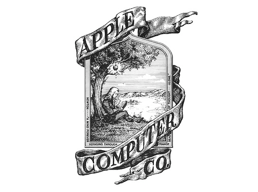
3. The Apple of My
Eye
The
original Apple logo was the brainchild of Apple CEO Steve Jobs and depicted an
apple falling on the head of Isaac Newton. The apple with a bite taken out of
it was created by graphic designer Rob Janoff in 1976. Its rainbow colours were
kept until 1999, when a monochrome version replaced it. An urban legend
suggests that the bite out of the apple is a nod to Enigma code pioneer Alan
Turing, who died after taking a bite from an apple he’d laced with poison.
2. The Golden Arches
The
original McDonalds logo back in 1940 was incredibly non-descript and its latest
incarnation – the world famous golden arches wasn’t introduced until 1962. The
design was by Jim Schindler, but the arch idea was dreamt up by company
co-founder Dick McDonald ten years earlier as an addition to their latest
restaurant. It wasn’t introduced into the architecture of the restaurant, but
was subsequently included in the logo. It was initially placed on the logo in
front of the new ‘drive-in’ restaurant design, but this was later dropped to
just the arches and the company name in the ubiquitous bright red. So
the arches were originally an architectural design.
1. The Swoosh
What
a nickname for a logo, “The Swoosh”, but we all know exactly what that means.
The Nike tick symbol that stands alone as a logo in its own right nowadays. The
emblem of many a trainer on our streets and tracksuits in our gyms, it has
become synonymous with urban cool. Incredibly, the designer of this multinational
icon was a university graphic design student called Carolyn Davidson, who charged a cringeworthy $35 for it in
1971. In her defence, Nike wasn’t the powerhouse it is today. They were just setting
up their new line of trainers, and didn’t even particularly like the logo at
first. Luckily and justifiably, Carolyn was later given company shares for her
contribution.
GROUP
3: 5 Keys of Successful Logo Design
The best logos make an impact.
They are memorable and they instantly evoke images of the brand with which they
are associated. Think of the Golden Arches in the McDonald’s logo or the
classic script in the Coca-Cola logo. Think of the peacock feathers in the NBC
logo or the swoosh in the Nike logo.
On the other hand, bad logos
are forgettable. They look unprofessional and they don’t tell you anything
about the brand.
Creating a successful logo can
influence the overall success of your brand. Whether you are a logo designer
yourself or if you are looking to hire a designer to create your logo, it is
important to understand the qualities of a great logo so you can get one that
encourages the success of your business. Here are 5 keys to successful logo
design:
Simplicity
One of the most important
aspects of successful logo design is simplicity. There should be clean lines
and few details like shading or other artistic touches. Colors should be
limited to a few choices. Text should be limited to the brand name. Some great
examples include the Nike swoosh, the Google logo, the Target bull’s eye, and
the Twitter “T.” In logo
design, less is more.
Recognition
Your logo will be synonymous
with your brand. Therefore, it must be instantly recognizable in any format or
medium. No matter what color, no matter what size, no matter what format, your
logo should be identifiable as the image for your brand. Think of social media
icons such as Facebook and Twitter: They use the logos for the most prominent
social networks, but they are often manipulated to fit the theme of a blog and so
are presented in different colors, different shapes, and different formats, yet
they are always recognizable.
Uniqueness
If your logo is to be
recognizable, it should also be unique. Otherwise, what is to say that the star
in your logo is not actually the start in another company’s logo? Common shapes
may be used, but they should be altered to create a unique logo for your brand,
such as through special coloring or other details. However, it is a much better
idea to create a unique logo that uses a unique shape or item that is not
likely to be used by another company. The Nike swoosh is another great example,
as is the apple with the bite taken out of it for Apple electronics.
Tone
Your logo must tell your
audience a bit about your company. What are your values? What kind of products
or services do you provide? While a simple logo may not be able to convey all
this information, it should create a certain tone that reflects your brand. For
example, a logo with a comic sans font and bright colors will convey a sense of
playfulness and irreverence. If you have a toy company, this may be totally
appropriate. (Think of the playful font in the Toys R Us logo.) However, if you
have a financial services company, this may make you seem unprofessional. Be
sure that your logo creates the right tone for your brand.
Transferability
Your logo will be used on
every item associated with your brand, including print materials, your website,
your social media, and your e-mail list. It is important that your logo can not
only be easily transferred to any of these mediums, but also that it will be
recognizable in each of them. For example, an animated logo may look great on a
website, but you won’t be able to use it in a print campaign. Will it look as
good as a static image? If not, you may want to consider a new logo.
Some successful examples
include the Nike swoosh logo and the McDonald’s arches. Those logos are
recognizable in almost any format.
There is a certain amount of
creativity and plain old luck required to create a successful logo. However,
ensuring that your logo has each of these elements can help you to create
something special that will help you to brand your company and connect with
your customers.
Does your logo have these
qualities? What do you consider the key elements of successful logo design?
GROUP 4: Four rules of logo design
1. Start with your brand
When
deciding on a logo consider your brand first. Ask tough questions. Know who
your clients are and what they want from you. Know what you want from your
clients. Do research and think hard about your company’s mission statement.
Remember
to ask the right questions internally. If you ask ten people if they prefer
blue or green, you won’t get anywhere. But if you ask, “Is it more important
that we look technical (blue) or trendy (green)?” then you’re moving in the
right direction. If you start out by showing logo concepts and asking what
people like, you’ve already lost. Once you’ve more clearly defined your
brand then you can ensure your logo effectively represents that brand.
2. Simplify
The
more lines, shapes, stories, colors, and fonts you have in your logo, the more
provincial you look. If being provincial is part of your brand then feel free
to break this rule. Otherwise less is more. Remember your logo isn’t the whole
story, it’s a single unifying thought.
Try
to limit your logo to a single font. Two is fine if your tagline is part
of your logo. Three is just wrong regardless of your size. Go for solid colors
over gradients. Gradients never print well and almost always look amateur.
3. Shoot for ten times your size
If
you’re a million-dollar-a-year company, your logo should be as strong, or
stronger, than your ten-million-dollar-a-year competitor.
Don’t
worry about what the other million-dollar-a-year companies are doing in your
space. Follow the advice of dressing for the job you want, choose your
logo for the multi-billion dollar capitalist success story you know you are.
4. Know that someone will hate it
Let’s
face it, someone isn’t going to be happy with your choice. Any major branding
changes, such as logos, should be combined with an internal public
relations campaign to make sure that people understand why you’ve
made the choices you made.
Make
sure anyone that can derail your design has their voice heard. The
only thing worse than getting two dozen opinionated, smart, dedicated people to
agree on one color is having five people pick the color and annoying the other
nineteen.
*************************************
FOLLOW-UP ACTIVITY: Test PWSZ Logo
Spend
a minute and answer the 14 questions below (you can do it in your head):
Get one point for each “yes” below
- Does your logo work horizontally?
- Does your logo have both horizontal and vertical options?
- Does your logo work in black and white?
- Does your logo work on both black and white backgrounds without a box around it?
- Can you sketch all non-typography elements in five seconds or less?
- Did you buy the font you used in the logo?
- Do you have fewer than two fonts?
Subtract one point for each “yes” below
- Do you use more than two colors in your logo?
- Do you have more than one shape in addition to the logotype in your logo?
- Are any shapes in your logo explicit instead of abstract? (i.e. a globe or something else recognizable)
- Did you use any clip art in your logo?
- Is there a photo or complex pattern in your logo?
- Do you have a gradient in your logo?
- Did you use default font kerning (not change spaces between letters)?
Scoring
<0 = Don’t even think about it1-4 = Acceptable for a $50-million-a-year company
5+ = Great job!
Improving
a logo relies on an understanding of brand and how
brand differs from the visual identity of a company or organization.
Brand vs. logo
Your
brand is the sum total of every interaction that someone has with
your organization. Your brand is the music a client hears while holding for a
call. Your brand is your parking lot. It’s your front lobby and how clean your
bathrooms are. Your brand is every interaction with someone on your team.
So
what part does your logo play in your brand?
Your
logo shows up everywhere. On your website, business cards, letterhead, signs,
cars, and advertisements. It goes everywhere you go.
But
it isn’t the logo’s job to tell the whole story.

niedziela, 3 listopada 2013
Colour and font type (UPDATE)
PURDUE - Online Writing Laboratory
Check out their tips on effective usage of colours and font types in your presentations.
Visual Rhetoric: Color
Color Theory Presentation (PPS)
Using Fonts with Purpose
Font Features (serif & sans-serif)
Font Personality
Additional Tips for Using Fonts
COLOR IN MOTION (please click, watch, explore & experiment)
Register
FAKULTET: Język w mediach i komunikacja audiowizualna
Język angielski z językiem rosyjskim/ Język angielski
Prowadzący: mgr Joanna Loesch
1.
Gnyla Martyna
2.
Jakubik Joanna
3.
Jasińska Justyna
4.
Jaworska Jolanta
5.
Pierzga Agnieszka
6.
Potoczek Jakub
7.
Sułowicz Ewelina
8.
Tomasik Marta
9.
Rosłański Krzysztof
10.
Siewiera Sylwia
11.
Sołtys Karolina
12.
Szkaradek Anna
13.
Uroda Bartosz
Subskrybuj:
Komentarze (Atom)